Typ09 Recap

November 2nd, 2009 by admin

The Typ09 conference came to a close on Friday and it was a really interesting experience. Type design is a whole world that I didn’t really know much about, considering the fact I’ve been working on NextText for over three years.

It had been a while since I had attended a conference, and although I usually have a problem with the closed bubble around these events, this was very refreshing. It was the first professional conference I attend, and was very different compared to academic ones. A large percentage of speakers focused on specific companies and projects, to the point where it sometimes felt like advertising (and in a sense, it was)

There were presentations on a wide range of topics: type-oriented university programs, focusing on single characters (like accents or quotation marks), web fonts, the step-by-step development of a specific font, etc. It was interesting to see that, much like in other spheres, there is a very prevalent nostalgia on the “old-school”. This could be seen in the many lectures on traditional foundries and handmade fonts.

My two favourite talks were coincidentally about typography in Brazil. Lambe-lambe Letters by Catherine Dixon and Henrique Nardi went through the process of creating posters in a lambe-lambe printshop. The letters are carved out of wooden blocks and printed on wheat paste paper using a manual printer. The movies were compelling; it was captivating to see the process and how spacing is calculated by adding shims between the blocks. Brasilêro Project by Crystian Cruz was about the process of designing a font based on hand-lettered signage found in Brazilian cities. It was quite interesting to see a typeface that started on the streets end up in magazines, books, and the web.
Typ09 Workshops

October 29th, 2009 by admin

We gave our NextText and Mr. Softie workshops today and it went really well. The turnout was a little lower than expected but that ended up being a good thing as we almost had a one-to-one presenter-student ratio. I was a little nervous leading up to the workshops as I realized over the first few days that type designers are not too keen on having their meticulously constructed glyphs tweaked by our software.

The NextText workshop had an extra challenge which was that we had to also teach the basics of programming in that 3-hour slot. It was a lot to cover, but the participants made it through and seemed to have a good handle on things towards the end. A few points to keep in mind for next time:

  • When going over the basics of programming, starting with functions before covering variables makes more sense. Functions can be used with literals at first and then variables.
  • When building a set of behaviours, it is really helpful to draw the behaviour tree, and to modify it as the code progresses.
  • We should have a basic sample sketch for each behaviour to show what it does. This should be included in the documentation, similarly to how it is done in the Processing reference.
  • Some of the behaviours should be renamed to something more intuitive.
  • We need a simpler way of creating behaviours. Perhaps bringing back the factories would be a good solution for this.

I would be very interested in trying this out again with experienced programmers. This would be ideal to test out the documentation and see how easy it is to understand, navigate, etc. It would also allow more time for free play, resulting in more complex and polished sketches.

The Mr. Softie workshop was a lot of fun and was actually the most time I ever spent in the software. In comparison with NextText, it was easier to grasp as the participants could start working on their visual sketches fairly quickly, and a lot of good looking work came out of it. A good measure of the success was that most people came back after the second break and some even told their friends to pass by and check it out.

  • The Textpad is a great tool and has a lot of potential. One feature that would be good to add is to toggle whether white space is sprayed or not.
  • The GUI could use a few improvements, mainly swapping the many drop-down menus for sliders, checkboxes, and radio buttons.

Mr. Softie Workshop at Typ09

October 29th, 2009 by Jason

We just finished the main portion of the Mr. Softie workshop. We had 9 students attend, and we still have 6 of them in the room with us experimenting with the tool. Bruno gave a good presentation that I think we should definitely consider taking to other places.

One thing we need to do is create a series of small .sft´s showing each of the SoftType behaviours in action, and even some combinations. What would be even better is a live preview option like Adobe Premiere has for its transition effects. And to make it easier to get a handle on the visual results of changing parameters, perhaps we should move to sliders there as well…

First Impressions at Typ09

October 27th, 2009 by admin

I just arrived in Mexico City today and after a short stopover at the hotel, headed downtown to the Typ09 conference.

The presentation layout is one of the best I’ve seen. The talks are given in the interior courtyard of the Museo Interactivo de Economía (MIDE). The podium is in the centre of the room and chairs are placed all around. Sixteen screens are installed on the perimeter of the room (four per wall), displaying the presenter’s slides. No matter where you are sitting, you have a good view of the presenter and her presentation. I can’t help but think about Most Pixels Ever and how this is a great setup for a multi-channel installation.

Kevin Larson from Microsoft gave a talk today on how typefaces have personalities and the research behind it. It was an interesting topic, but I felt like it needed more substance. Most of the points seemed obvious and felt like he was preaching to the choir, and the rest could have used actual statistics and data.

Kettle

June 12th, 2009 by admin

This is the pot and the kettle with coffee and splash. Words (kettle, pot, coffee, splash) twisted into illustrative form.

Kettle

Kettle

Heart

June 3rd, 2009 by admin

Heart

Heart

That which binds

May 25th, 2009 by admin

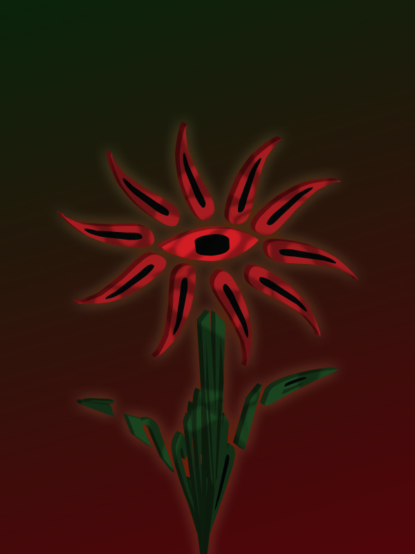
That which binds (Blasphemy)

That which binds (Blasphemy)

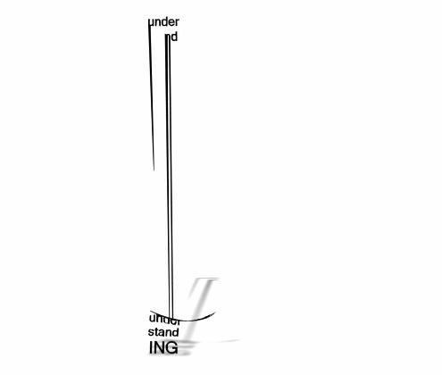
stand under

April 23rd, 2009 by admin

Ongoing online series of Softie video experiments : http://glia.ca/conu/SOFTIES/

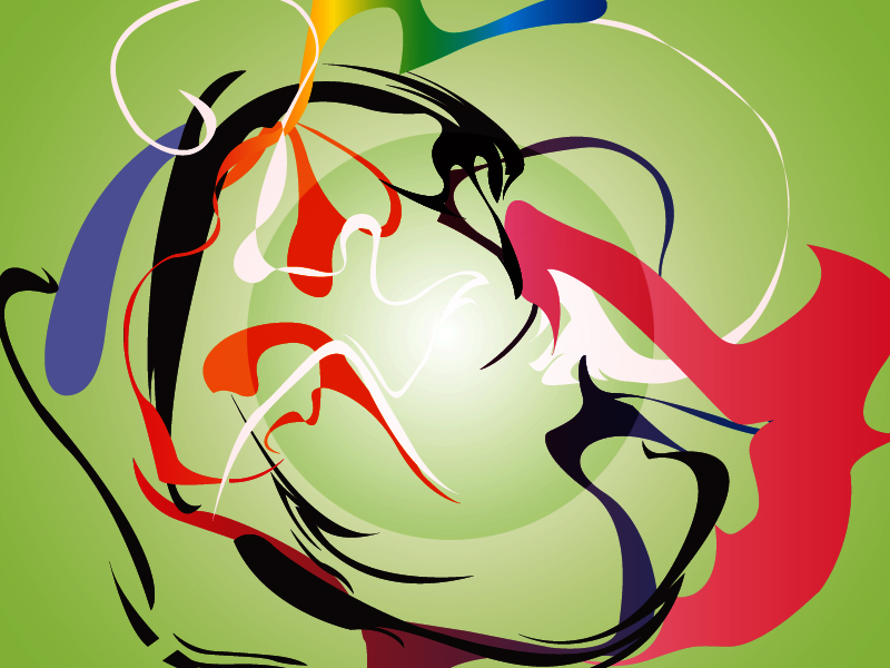
3 pieces

April 23rd, 2009 by admin

Lunar Madness

Lunar Madness

Rainbow Sphere

Rainbow Sphere

At First Sight

At First Sight

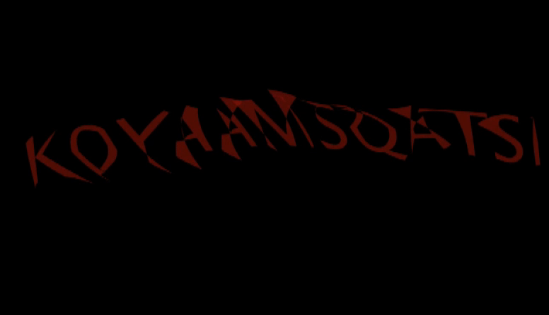
koyaanisqatsi

April 16th, 2009 by admin

a chant: an exercise in massaging letters, in making them dance, in finding a rhythm, in creating irregular shapes and motions.

Kooyanisqatsi

Kooyanisqatsi